呉竹の顔彩で描いた春の滝桜 ~水彩との違いとは?
春の滝桜からのインスピレーション
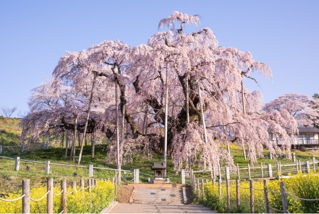
この春、福島県・三春町にある日本三大桜のひとつ、樹齢1000年以上の「三春の滝桜」を訪れました。夜桜と朝焼けに包まれる姿、両方の美しさに圧倒され、以前アクリル画で作品を描きました(→その記事はこちら)。
今回は、異なる画材「顔彩」を使って、もう一度この滝桜を表現してみたのでご紹介します。
使用したのは、呉竹の「顔彩耽美」シリーズ。水彩絵の具のように水で溶いて使うことができる、日本画の流れを汲む美しい固形絵の具です。
この記事では、作品紹介とあわせて、「顔彩と水彩絵の具の違い」についても、私なりの視点でお話ししてみたいと思います。
顔彩と水彩の違いって?
私自身、アクリルと水彩の違いはなんとなくイメージできていたのですが、「顔彩って水彩とどう違うの?」と聞かれると、最初はうまく答えられませんでした。
顔彩はもともと日本画に使われていた絵の具で、「顔料+膠(にかわ)」でできています。一方、水彩絵の具は「顔料+アラビアゴム」。見た目は似ていても、性質が少し違うんです。
| 観点 | 顔彩 | 水彩絵の具 |
|---|---|---|
| 原料・発色 | 日本画の伝統的顔料+少量の膠 | アラビアゴム+合成顔料(海外製が多い) |
| 色の印象 | 渋み・深み・和の雰囲気 | 明るく透明感、ポップな色味 |
| 定着感 | マット寄り、落ち着いたトーン | 発色が鮮やか、ツヤがあるものも |
| にじみ・ぼかし | 控えめで、線が残りやすい | 大きくにじむ、ぼかしやすい |
| 耐久性 | 色によっては退色しにくい | メーカーにより異なるが退色しやすい色も |
顔彩は、にじみやぼかしが控えめなんです♪
色の美しさを一筆一筆で見せていくような絵にGood。
和の風合いや落ち着きが必要なモチーフ、たとえば桜や四季の草花、静かな風景などと相性抜群!
呉竹「顔彩耽美」レビュー
今回使用したのは、母がプレゼントしてくれた呉竹の「顔彩耽美」シリーズ。和の色名とともに並ぶ美しい顔彩の数々に、まずは心がときめきました。
発色はしっとり深く、特に青系の色味に魅了されました。桜モチーフにもぴったりの淡く優しい色も揃っていて、透明感のあるやわらかい表現ができます。

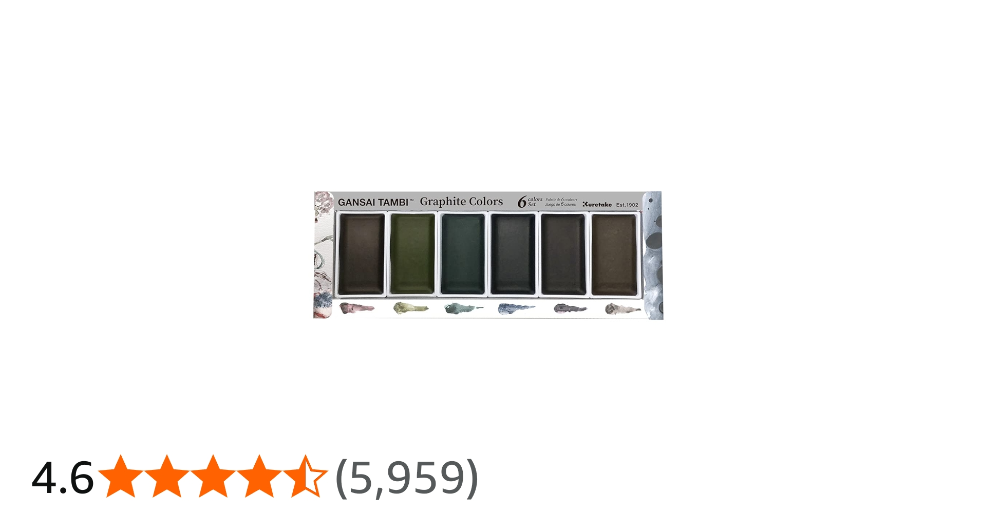
このシリーズには、「アールヌーヴォーカラー」「グラファイトカラーズ」「ニュアンスカラー」「グラニュレーティングカラー」などのバリエーションもあり、色にこだわる方にはたまらないラインナップです。↓
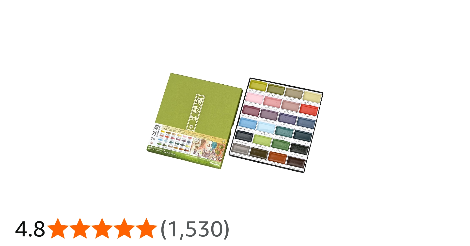


プロ用の水彩絵の具と比較しても、顔彩耽美のセットはコストパフォーマンスが高く、品質と価格のバランスがとても良いと思います!✨
今回は淡い桜色を表現するのに少し苦戦したため、ピンクと金色だけはアクリル絵の具を少し混ぜて調整しました。
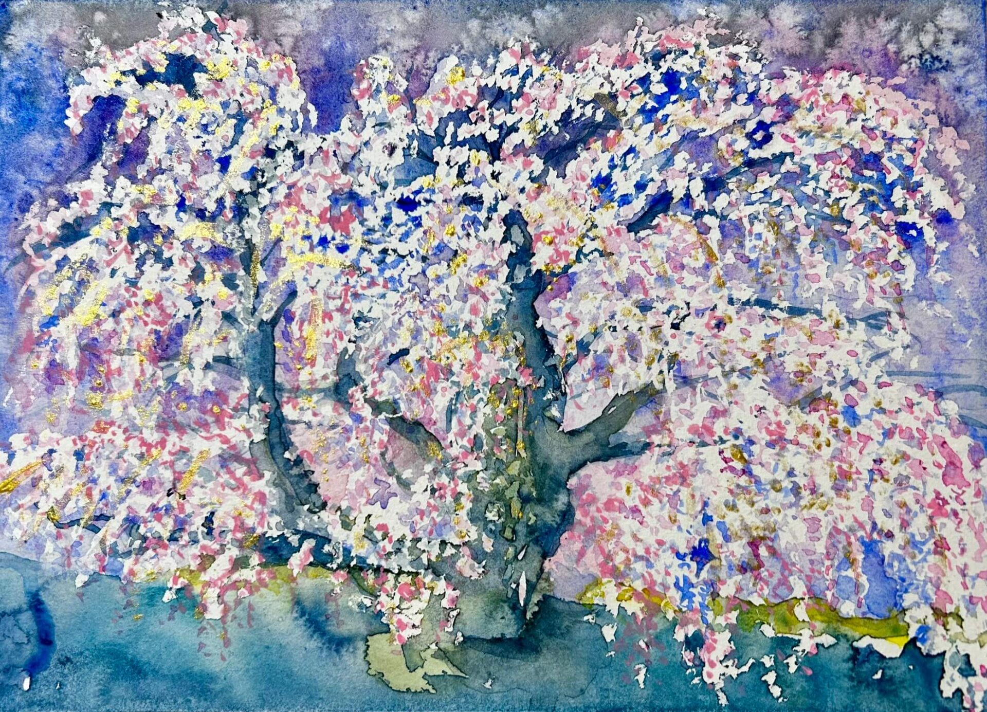
顔彩で描いた「滝桜」
この作品は、三春の滝桜を画面いっぱいに描いたものです。夜桜と朝桜、どちらの姿にも異なる魅力があり、それぞれのインスピレーションをひとつの絵に込めました。
背景は昼とも夜とも取れるような、不思議な時間帯。神秘的な雰囲気を出したくて、空の部分には藍色のグラデーションをかけた上から塩をまいて、自然な模様を浮かび上がらせています。
滝のように垂れ下がる花びらは、マスキング液で一度保護してから色を重ね、立体感と繊細さを両立させました。さらに、朝日やイルミネーションの光を表現するため、部分的に金色のアクリルを加えてきらめきを表現しています。
大樹としての圧倒的な存在感と、花びらのやさしい揺らめきを同時に描き出したくて、筆を入れるたびに「すごいね、滝桜。みんなを優しく包み込んでね・・・」と語りかけながら仕上げました。
まとめ
顔彩は水彩に比べると地味な印象を持たれるかもしれませんが、その渋さと深みは、和の美を描くにはとても魅力的な画材です。
今回使用した呉竹の「顔彩耽美」は、初心者にも扱いやすく、でも色の表情はとても奥深く、アートの幅を広げてくれる素敵な道具だと感じました。
桜のような繊細で日本的なモチーフを描く際には、顔彩ならではの魅力が存分に活かされます。これからもいろんな画材を試しながら、自分の「好き」を絵にしていきたいと思います♡
🌸 English Version Below Thank you for reading! The English version starts here. Hope you enjoy it!」↓
🌸 Spring Cherry Blossoms with Gansai Tambi: Painting the Takizakura with Japanese Colors
1. [Introduction]
In this post, I’m sharing a painting of the famous Takizakura—one of Japan’s three greatest cherry blossom trees—created using Gansai Tambi, a traditional Japanese paint set by Kuretake.
Previously, I introduced an acrylic version of this piece inspired by seeing the real tree in Fukushima this spring. (Insert link)
This time, I used gansai, a unique Japanese painting medium, and compared it with watercolor to explore its distinct characteristics.
Gansai paints are solid, water-soluble pigments similar in usage to watercolors, but they have a different composition and expression.
2. [Art Perspective]
Many beginners may understand the difference between acrylic and watercolor. But the difference between gansai and watercolor? It’s not so obvious!
Gansai, traditionally used in Nihonga (Japanese painting), is made with pigments and a small amount of animal glue (nikawa), giving it a heavier and more subdued quality than watercolors, which are usually made from synthetic pigments and gum arabic.
Here’s a comparison chart:
| Aspect | Gansai | Watercolor |
|---|---|---|
| Ingredients | Traditional Japanese pigments + nikawa (glue) | Gum arabic + synthetic pigments |
| Color quality | Deep, calm tones with a Japanese aesthetic | Bright, transparent, and vibrant |
| Texture | Matte, subtle finish | Glossy, vivid transparency |
| Blending | Controlled bleeding and edges | Wide and soft bleeding and blending |
| Durability | More resistant to fading (depending on pigment) | Some colors may fade more easily under light |
The Gansai Tambi set I used was a gift from my mother. I love the richness of its colors, especially the blues. They’re subtle yet striking—perfect for painting cherry blossoms.
Compared to watercolors, gansai applies more boldly to paper. The bleeding is limited, so it’s not suitable for watery, soft-blending techniques. But it’s perfect for traditional-style works or paintings that highlight the beauty of each individual color.
3. [Review of Gansai Tambi by Kuretake]
This time, I used the Gansai Tambi set from Kuretake. (Insert link)
They also offer other stunning series like Art Nouveau Colors, Graphite Colors, Nuance Colors, and Granulating Colors—I want them all!
While often used for postcard art (etegami), I think many people will fall in love with their deep, elegant hues. Even without mixing, each color has a refined, “just right” tone.
Compared to professional watercolor sets, the quality-to-price ratio of this set is outstanding.
Note: For the soft pink of the cherry blossoms, I added some pink and gold acrylic paint since it was difficult to express with gansai alone.
4. [Artwork Introduction]
This piece of “The Takizakura of Miharu” captures the awe I felt when seeing the tree both at night and in the early morning. Both scenes had their own unique charm, and I combined them into one painting.
The background is ambiguous—neither purely night nor day. The over-1,000-year-old tree has an overwhelming presence, with countless blossoms creating powerful waves of life.
Techniques Used:
-
To express the tree’s mystic aura, I used gradients and sprinkled salt on indigo to create textured patterns.
-
I masked off the blossom areas first with masking fluid, then painted over them.
-
To show the glow from illumination at night and the golden light at dawn, I applied gold acrylic paint on top.
5. [Conclusion]
Gansai paints offer a distinct, poetic depth that blends beautifully with traditional Japanese motifs like cherry blossoms.
If you’re looking to explore a new medium with elegance and cultural depth, Gansai Tambi is a great place to start.
#顔彩耽美, #呉竹, #GansaiTambi, #滝桜, #三春の滝桜, #桜アート, #和の色, #水彩画, #アート制作過程, #JapaneseArt, #CherryBlossomArt, #SakuraPainting, #WatercolorVsGansai, #ArtWithRikka, #SpringInJapan, #MiharuTakizakura, #GansaiPainting, #和のアート, #rikkaartroom,#whisperofcolor