

Whisper of Color へようこそ!

はじめまして、Rikka(リッカ)です。
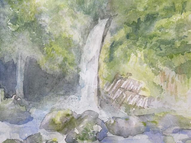
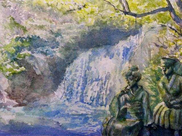
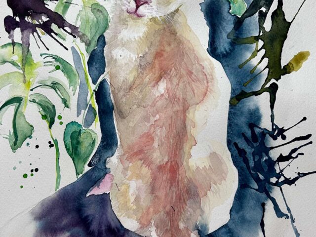
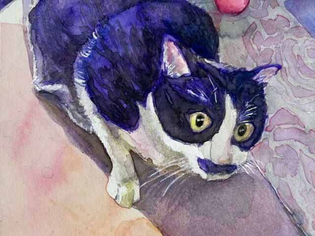
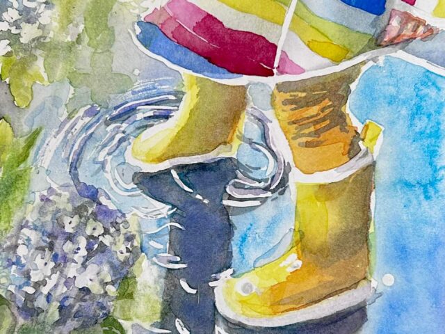
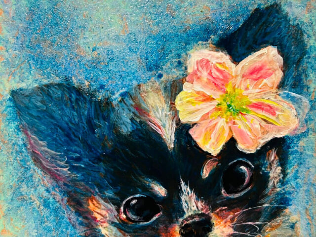
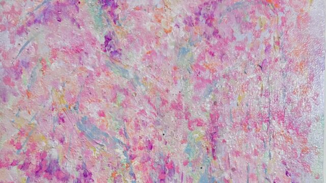
このサイトでは、水彩、アクリル画を中心に色と心に寄り添うアートをお届けしています。
色のにじみや重なりを楽しみながら、日常にちょっとした魔法を感じてもらえたら嬉しいです💛
「リッカの水彩カフェ」へようこそ
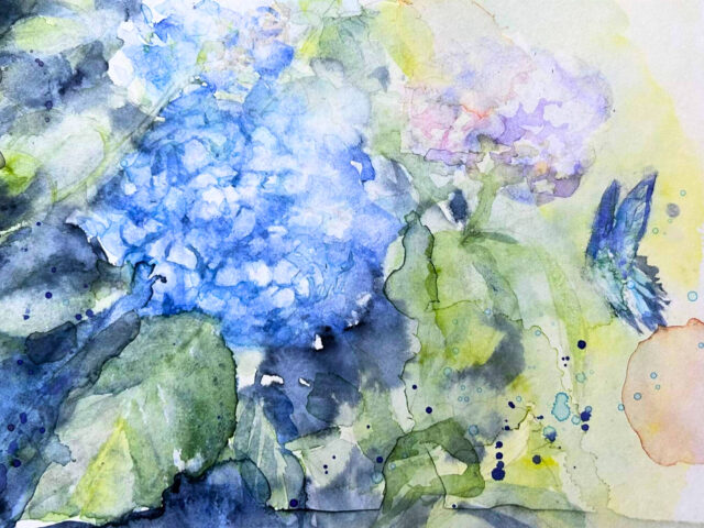
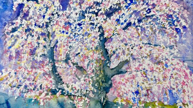
「リッカの水彩カフェ」は、水彩のにじみと色の魔法を楽しむカフェのような場所。
日常のちょっとした瞬間や、心をほっとさせる色彩の世界を、水彩を通してご紹介。
- 「リッカの水彩カフェ」体験風コンテンツで、自宅でもゆるっと水彩を楽しめます
- 紅茶や水彩にまつわる小ネタも、カフェでおしゃべりしている感覚で読めます
- 作品制作の過程や気づき、使っている画材や技法もシェア
🌸 気に入った作品やアイデアは、SNSでぜひシェアしてくださいね。紅茶ネタもお待ちしております!
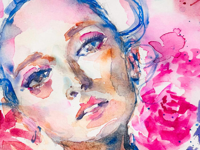
色に込めた想い
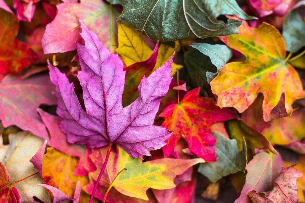
私は、青やピンクなどを好みますが、好きな色には思い出や感情が宿っています。
水彩ならではの偶然のにじみや色の重なりは、心にそっと物語を届けてくれる魔法のような存在。
直感も計画も大切に、色と一緒に旅をするようなアートを描いています。
これから発信していくこと

- 「リッカの水彩カフェ」体験風コンテンツ
- 紅茶や水彩にまつわる小ネタ
- 水彩作品の紹介
- 作品制作の過程や気づき
- 使用している画材やお気に入りの技法
アートをもっと身近に、もっと自由に感じてもらえるコンテンツをお届けします✨
おわりに
このサイトはまだ始まったばかりの小さな旅。
色のささやきに耳を傾けながら、一緒に歩んでいけたら嬉しいです。
👉 プロフィールはこちら( Rikka について)